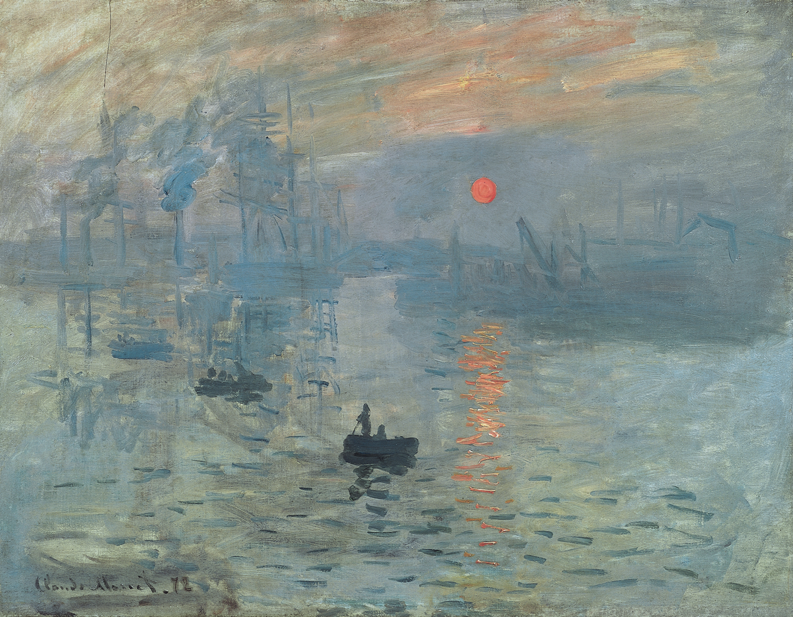

Colour theory: teaching, slides and exercises
Primary colours, the colour wheel, warm and cool colours, opposite colours and shades, explained through real works of art. Suitable for the whole primary school.
Colour theory explains where colours come from, how to mix them and how they create a mood. The article suits the whole primary school: things are explained simply first, and the "Explore more" notes give older pupils something extra. Every step can be shown to the class as a slide.
At the end, pupils know the words primary colour, secondary colours, colour wheel, warm and cool colours, opposite colours and shade. They can mix colours and say why an artist chose particular colours.
Key concepts
- light
 Energy that lets us see. The sun is the most important source of light.
- prism
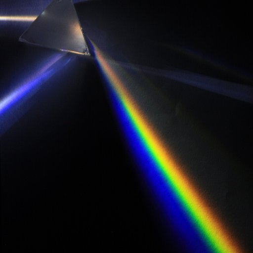 A piece of glass that splits white light into the colours of the rainbow.
- rainbow
 A colourful arch in the sky when the sun shines while it rains.
- red
 A colour like a strawberry or a fire engine.
- yellow
 A colour like the sun or a banana.
- blue
 A colour like a clear sky or the sea.
- green
 A colour like grass and the leaves of trees in summer.
- artist
 A person whose job is to make paintings, sculptures or other art.
Related exercises
1. What colours do you see?
What colours are in the picture?
Where do colours come from?
Which colours feel warm and which feel cool?
Why did the artist choose these colours?2. Colour is light
Sunlight looks white, but it contains all the colours of the rainbow. Raindrops split light into colours: red, orange, yellow, green, blue and violet. A red object reflects red light and absorbs the others.
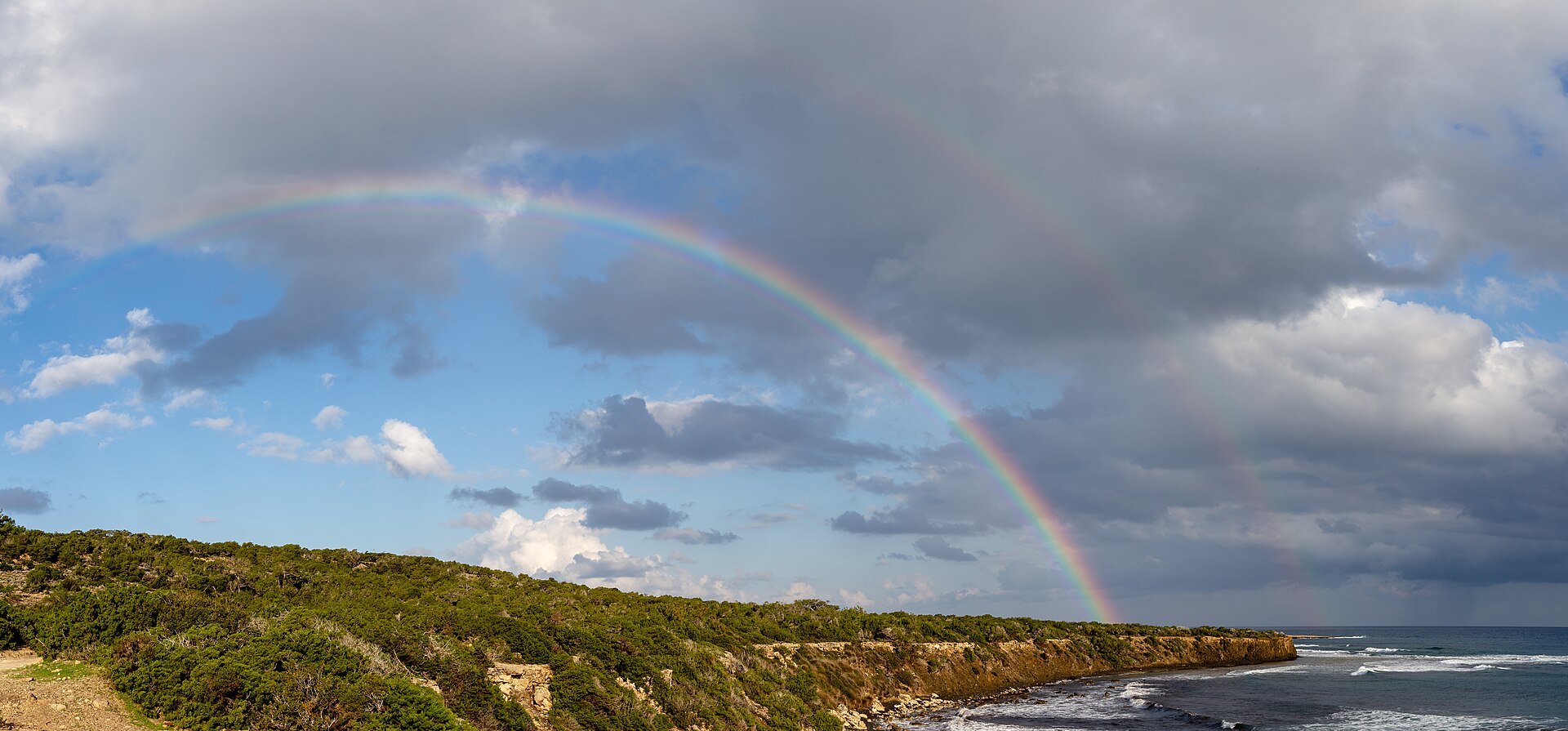
A rainbow. Its colours are always in the same order: red at the top, violet at the bottom.. Photo: A double rainbow in Akamas Peninsula, Cyprus, Michal Klajban, CC BY-SA 4.0, modified: reduced in size 3. The colour wheel: primary and secondary colours
In school painting, the primary colours are red, yellow and blue. They cannot be mixed from other colours. The secondary colours are made from two primary colours: orange, green and violet. The colour wheel shows the colours in order.
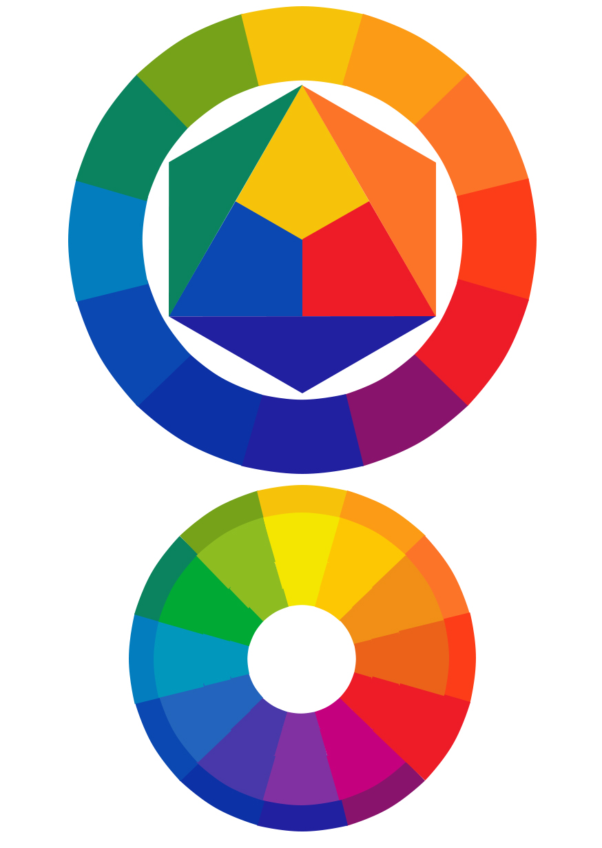
An Itten-style colour wheel. As a digital app it is brighter than paints, and the violet here is bluish.. Photo: Itten's wheel real colors digital adaptation, EugeGreco, CC0, modified: reduced in size 4. Warm and cool colours
Warm colours are red, orange and yellow, and they remind us of the sun and fire. Cool colours are blue and, close to it, green and violet, and they remind us of water and ice. A picture can have both.
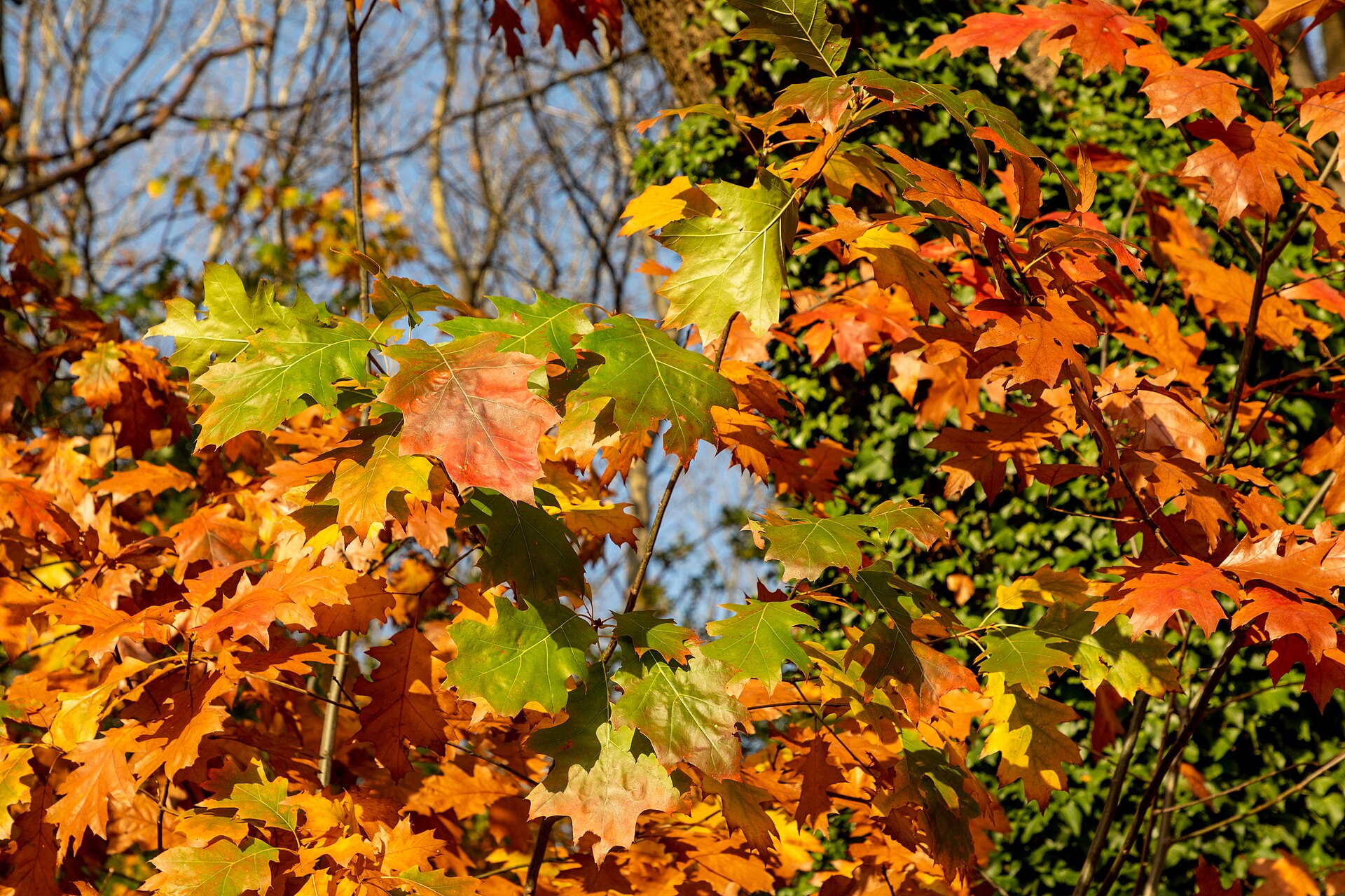
Autumn leaves: orange, red and yellow. Warm colours.. Photo: Dülmen, Börnste, Herbstlaub -- 2020 -- 3562, Dietmar Rabich, CC BY-SA 4.0, modified: reduced in size 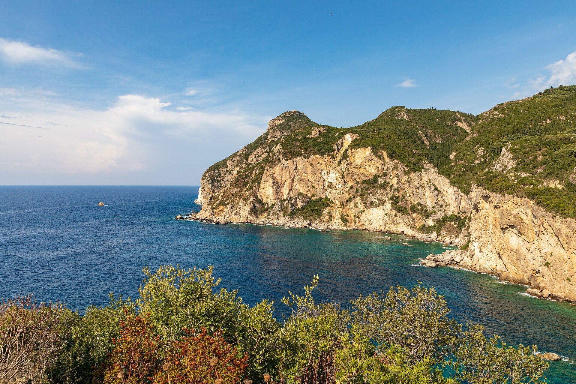
Sea and sky: blue. Cool colours, and the warm colour of the cliff stands out from them.. Photo: Korfu (GR), Paleokastritsa -- 2018 -- 1254, Dietmar Rabich, CC BY-SA 4.0, modified: reduced in size 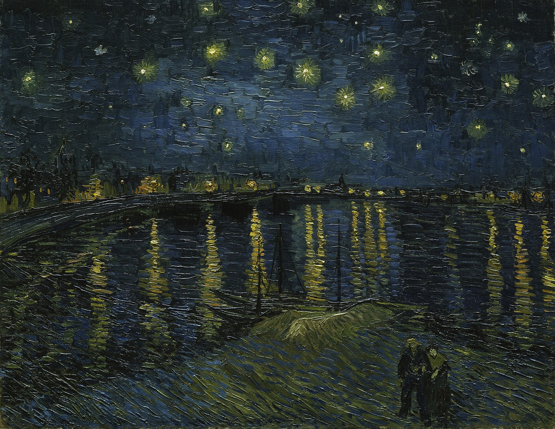
Vincent van Gogh: The Starry Night (1889). A cool blue sky and warm yellow stars.. Photo: La Nuit étoilée (The Starry Night, 1889), Vincent van Gogh, Public domain, modified: reduced in size 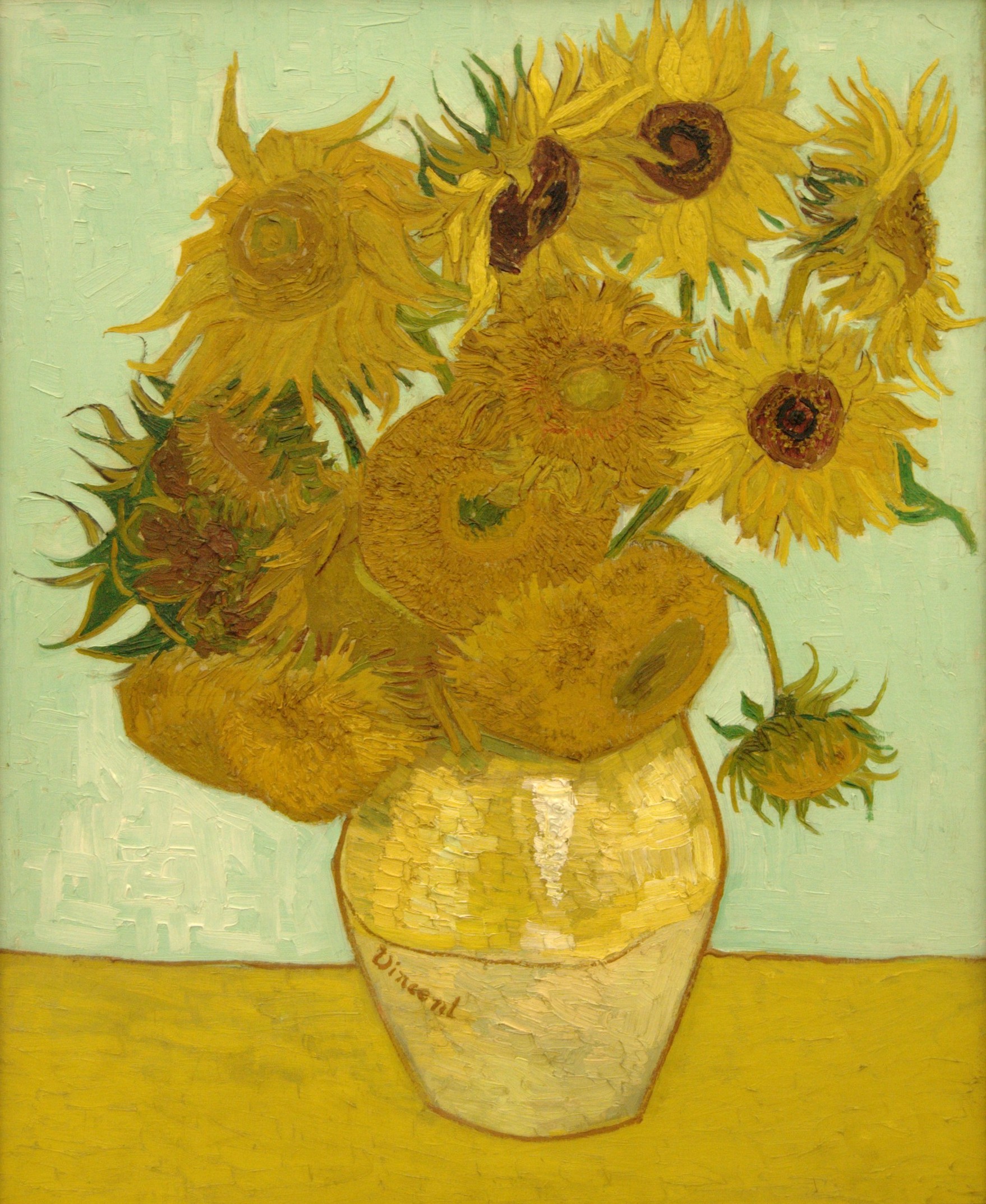
Vincent van Gogh: Sunflowers (1888). Almost all the colours are warm.. Photo: Zwölf Sonnenblumen in einer Vase (1888), Vincent van Gogh (kuva: Bibi Saint-Pol), Public domain, modified: reduced in size 5. Opposite colours and contrast
Opposite colours are across from each other on the colour wheel: yellow and violet, blue and orange, red and green. Side by side they make each other stand out. The result is a strong contrast.
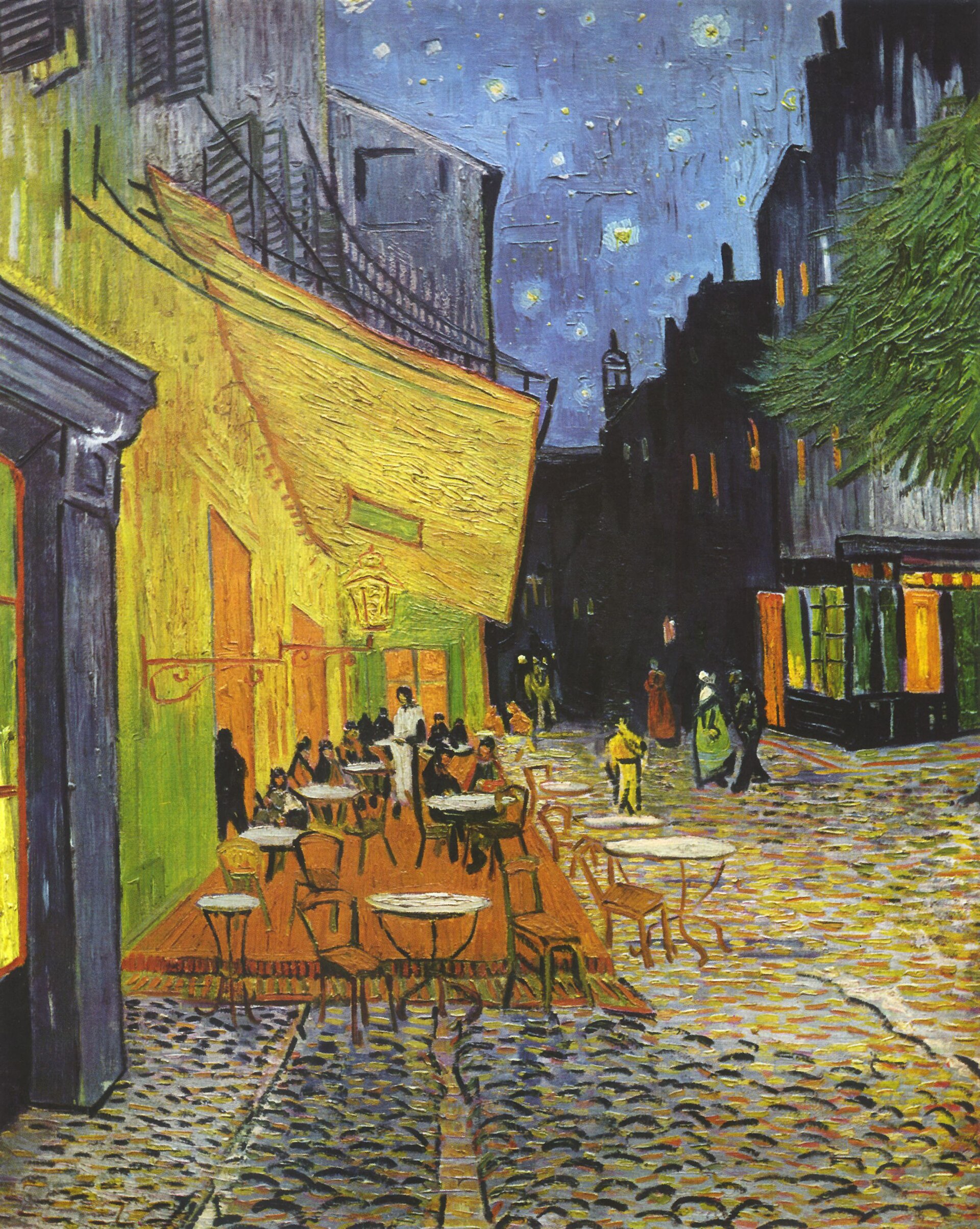
Vincent van Gogh: Café Terrace at Night (1888). Orange and yellow glow against the blue night.. Photo: Café Terrace at Night (1888), Vincent van Gogh, Public domain, modified: reduced in size 6. Shades and mood
A shade changes when you add white (lighter) or black (darker) to a colour. Colours affect the mood. Blue and green shades can calm us. Red and dark colours can feel restless.
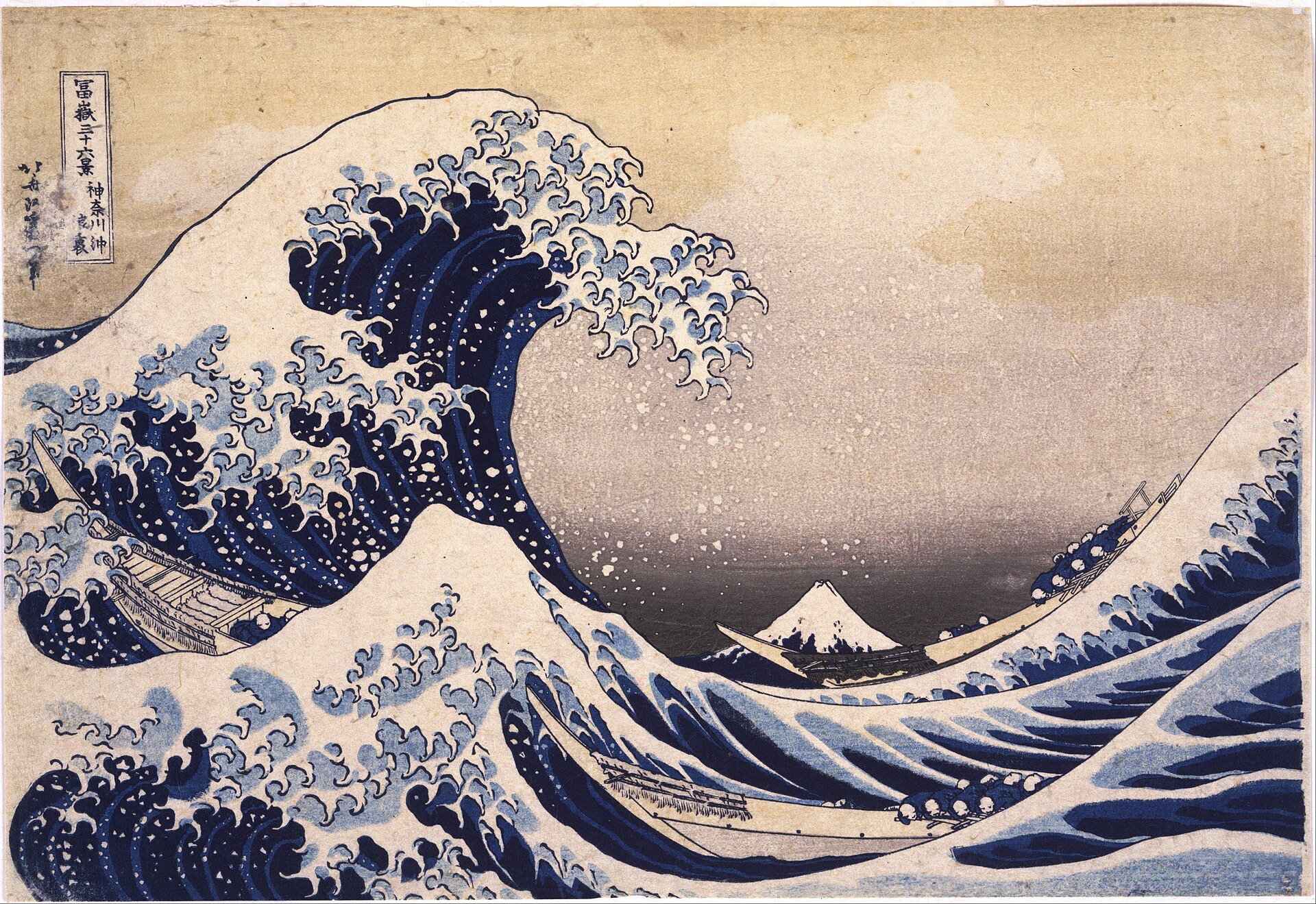
Katsushika Hokusai: The Great Wave off Kanagawa (c. 1831). Shades of blue from light to dark.. Photo: The Great Wave off Kanagawa (n. 1831), Katsushika Hokusai, Public domain, modified: reduced in size 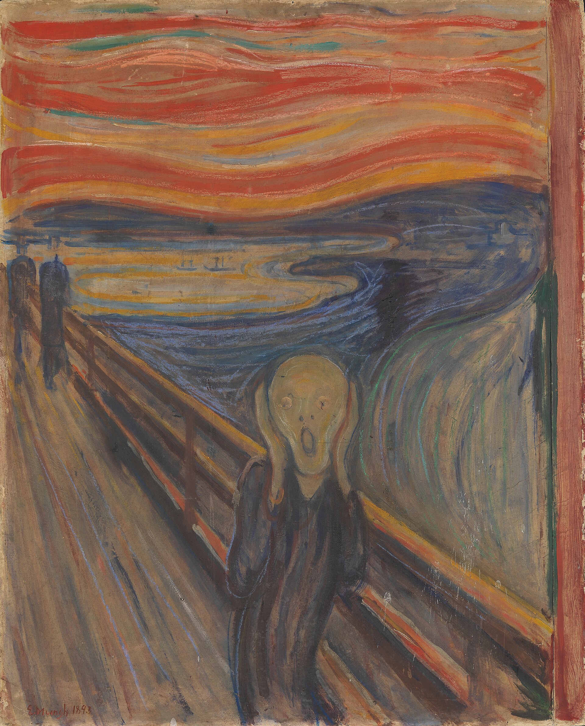
Edvard Munch: The Scream (1893). The red-orange sky and dark colours create a restless mood.. Photo: Skrik (Huuto, 1893), Edvard Munch, Public domain, modified: reduced in size 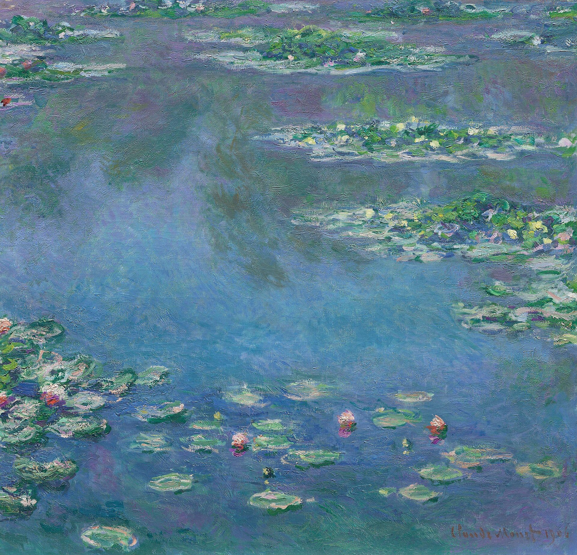
Claude Monet: Water Lilies (1906). Calm blue and green shades.. Photo: Water Lilies (1906), Claude Monet, Public domain, modified: reduced in size 7. Try it yourself and think about it
Mix red and yellow watercolours: what colour do you get?
Add white and then black: how does the shade change?
Find a warm colour, a cool colour and two opposite colours in the classroom.
Why are the teams' shirts different colours?


Summary
Colour comes from light, and a rainbow shows the colours of light. In school painting the primary colours are red, yellow and blue, and from them you mix the secondary colours orange, green and violet. The colour wheel shows the colours in order. Warm colours are on the red and yellow side, cool colours on the blue side. Opposite colours are across from each other on the colour wheel and create contrast. White makes a shade lighter and black makes it darker.
Frequently asked questions
What are the primary colours?
In school art lessons the primary colours are red, yellow and blue. Screens and printers use different base colours (a screen uses red, green and blue light, a printer uses cyan, magenta and yellow), but when painting we use this three-colour model.
Why does a mixture turn brown or grey?
When you mix many colours, or opposite colours, the colour gets darker and duller. All three primary colours together give brown or grey. The colour stays brighter when you mix only two primary colours at a time.
What is a shade?
A shade is a lighter or darker form of the same colour. You add white to make a lighter shade and black to make a darker one. The base colour stays the same: light blue is still blue.